
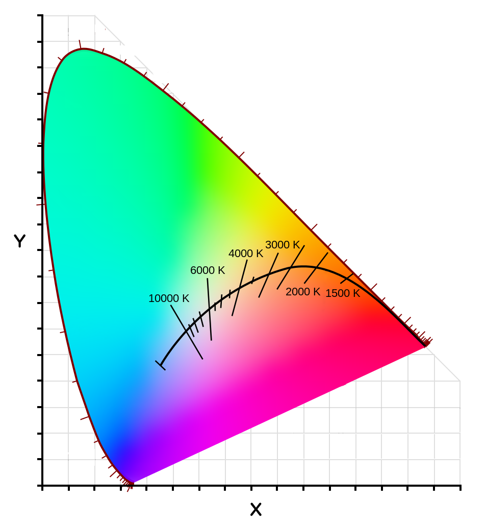
The Kelvin scale has always been relatively simple to understand in the context of display calibration. Choose a higher value and your display white point will be bluer; choose a lower value and it will be yellower, etc. But this is where the simplicity stops and the confusion begins. What do we do if the white point appears to be magenta or greenish? And why doesn’t the display calibration Kelvin value correlate with the value of our lighting? In other words, why does calibrating to ~5700 Kelvin match 4100 Kelvin lights? Why can’t we calibrate to 4100K to match 4100K lights? So hard for new users…

For years, I have encouraged people to choose a Kelvin value that allows for the whites on-screen to match paper white under their critical print lighting, using 5700K as a starting point. Picky users like myself often end up switching to more precise controls that allow for X and Y color axis control points. This way demanding users wanting a a better paper white match on-screen can make small adjustments adding or subtracting any hue in the spectrum.
There are lot of monitors and software used for display calibration, and I can’t go into all of them here. NEC and others have had great tools for tweaking the white point after measurement in real time. Most programs require that you make separate profiles with different white point settings.
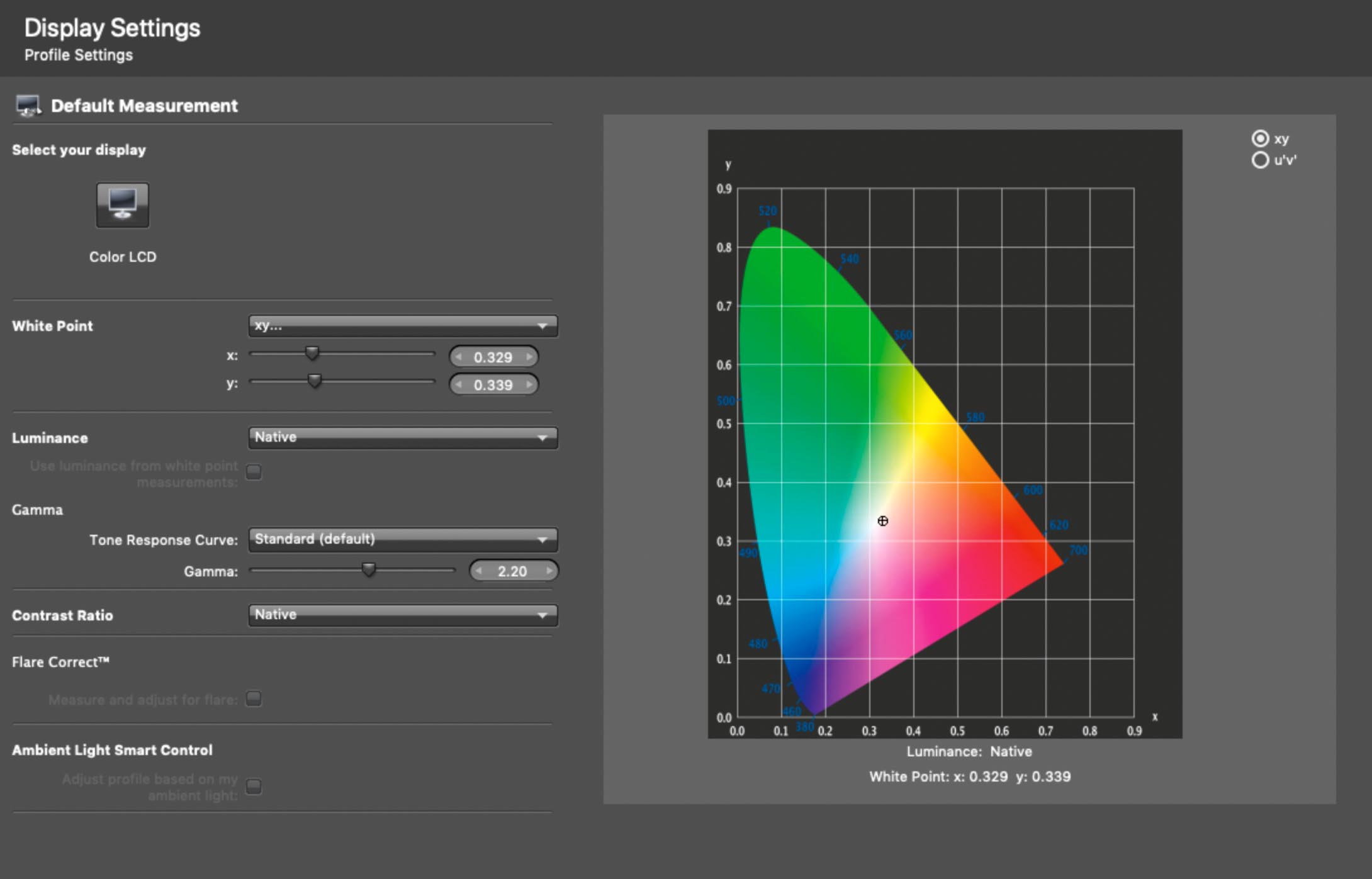
For those using XRite’s i1Profiler to calibrate their monitors, let me suggest x=0.329 y=0.339 as a new starting point. Once you’ve calibrated and compared the white’s onscreen to paper white, you can repeat the process tweaking the white point x y cross hairs using the intuitive chart. Increasing the y value makes the white greener – decreasing y makes them more magenta, etc. A single click in either direction is significant so make small changes of less than 10 between calibration attempts. Save these x and y values in the name of your display profile so you can refer to them later.
Well calibrated displays should have matching paper whites, both in terms of color and brightness. Once you use more precise white point controls that allow for X and Y color axis control points, I think you’d never want to think about display calibration white point settings in terms of Kelvin ever again. IMO, it’s time we move on from that.
In other words, why does calibrating to ~5700 Kelvin match 4100 Kelvin lights? Why can’t we calibrate to 4100K to match 4100K lights?
Yes! So annoying. It’s a flawed metric for display calibration purposes, for several reasons. The x y method instantly provides the control an advanced user needs. Hope you find this helpful!
Thank you! Very useful approach .
The problem comes when we dont know the lights where the photos will be viewed.
What you suggest in such situation?
HI George and thanks for your interest. You’re raised an important point here and the response is complex. First of all let be suggest that critical print viewing under high quality, high CRI lighting is of primary importance. Without high quality lighting we can’t see imperfections nor the beauty of a print in all it’s glory. I recommend high CRI lighting in the 3000K to 4100K range and discourage the cooler 5000K lighting that was the rule of thumb years ago. To take this a step further, I’d like to suggest that those working within an art context think about high quality exhibition lighting and bringing that same exhibition lighting into the printmaking studio. Light your studio like a gallery using bulbs like those I suggest on my recommendations page. View prints in these same lighting “hot spots” on a wall. Calibrating our displays to match that lighting is of secondary importance, and that’s what this article is about: customizing the calibration to better match the lighting we’re viewing prints under.
But you are asking about compensating for the destination lighting somewhere else. There are always exceptions, but let me just suggest that we must not worry about how our prints will look under poor quality lighting elsewhere. We can however, encourage print buyers to purchase high quality lighting (install track lights, good bulbs directed at the artwork, etc).
We must make sure our prints look as best they can under high quality lighting, but we really con’t worry about how poor they might look under low quality lighting. Sure, a print might look dark and yellow under candlelight, or weird and a little magenta under wacky fluorescent lights. Again there are rare exceptions to this and ways of addressing it, but I think it’s important for printmakers to make sure they are viewing prints under high quality light, possibly some other lighting scenarios, make sure your prints look their best under this light and not stress out over how they might look under poor quality lighting.
After all, the same thing can be said for image viewing on monitors. We can make sure our images look their best on a calibrated display but we can’t worry about how they might look on an uncalibrated display. Your website will look horribly blue on some displays and loose highlight and shadow detail on others, etc. The same can be said for your prints. By viewing our prints under a variety of lighting conditions, escpially high quality lighting, we’re doing our job as printmakers and making the best, well informed prints we can.