20+ years ago I was splitting my time between a job where I was a Leaf45 scanner operator and an apprenticeship with a master printmaker. In the printmaking studio we were making large digital negatives on an imagesetter and using them to make hand-coated platinum/palladium prints in a wet darkroom. Back then everyone was using Photoshop 2 and had CRT monitors. While the color scans coming off the Leaf45 seemed pretty decent after a little color correction in curves, I was frustrated with how different the handmade B&W platinum palladium prints looked in comparison to the same images onscreen. We had developed curves to linearize the imagesetter that made the negatives but still, the prints on Arches Cold Press paper looked soo much different than they did onscreen. The paper had a warm tone that was darker and more yellow that what I saw onscreen. And the platinum palladium blacks were much lighter and warmer than the deep neutral blacks we saw onscreen.

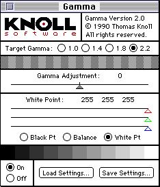
One day in the early 1990s I decided there had to be a way to fix this problem. I launched the Knoll Gamma Control Panel and made radical adjustments to the black and white points to match our wet darkroom platinum palladium printing process. I had been using Knoll gamma for a while but had never attempted to make such radical adjustments like matching the paper color and gentle blacks of a 19th century printing process. With just a minute's worth of work I was able to get an astonishingly excellent match! All of the sudden, everything on screen looked like platinum palladium prints – even email! I saved these settings for platinum palladium and made another set of settings for the 4 color press work I was doing at my other job.
I was so excited about 'monitor matching' that I started going around to everyone I knew adjusting their monitors to match whatever printing process they were working with. I learned to adjust the RGB gain, brighness and and contrast settings on their CRT monitors before doing the final tweaking in Knoll gamma.
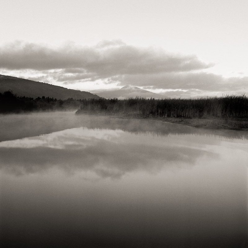
 Platinum Palladium print made from a digital neg in 1994
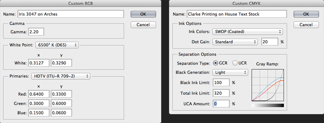
Before I know it, I was getting phone calls from complete strangers in advertising agencies, print shops and service bureaus asking if I could visit them and 'match their monitors'. I started charging for this service in 1994 and have been doing it ever since. I became a drum scanner operator shortly afterwards using the world's first drum scanner that supported RGB scans in addition to CMYK. Scanning in RGB was a revolutionary concept that I loved because I could better correct the images and convert them to a custom printer color space that I had created. Before I knew it, I was getting phone calls from places like New York, Iceland, London, etc from people that wanted to get the same scanner and hire me for a few days of training. In the late 90s, Photoshop 5.0 brought ICC profiles to the masses and devices like the MC7 and Colortron took things to the next level and the color consulting work became a demanding 60+ hour a week full time gig for me. That was when I created the "Onsight" name for the business I had already been doing for years.


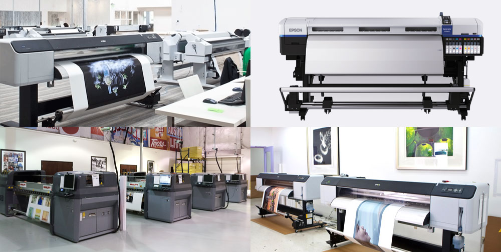
Looking back, I'm surprised that I'm doing a lot of the same things I did so long ago. I would have thought that color management with ICC profiles would have been automated by now. Apple's CRT Studio Display calibrated itself 15 years ago and today HP's Z series pritners make their own profiles with an onboard spectro. I would have thought that all displays and printers would work in this way by now and I'd be doing something else. I'd like it if there was better integration throughout the industry so that people like myself weren't as needed. I like progress and don't fear change.

– Scott Martin

Dude. i remember Knoll gamma making my life easy when I was working in a digital lab way back in the day, around 2000. Manning an Imacon mini drum scan and some 20″ digital printer that worked with silver process chemistry to produce prints. Was it called a Pegasus? Can’t remember, but it was rad at the time.
Anyway, thank you for your pioneering work! Knoll Gamma window is forever burnt into my subconscious mind.
Congrats are very much in order. I’m amazed that you can find time to conduct your night-time photography workshops.
Frank
V&PA
Clark University
Thanks Frank! Finding time to make one’s own images is the most important thing isn’t it? All this print quality stuff isn’t much without the right content to work with. Cheers.
Scott, congrats. An enormous amount of experience you have built up.
Jan R. Smit
Thanks Jan!