
1 ) Make adjustments in the proper order working from the top down. Set white balance first, then Exposure, etc. Don’t skip around.
2 ) Ignore the midtones when adjusting Exposure and consider only the white clipping point. One must ignore the midtones as they will be adjusted via Brightness later in the workflow. If some whites are clipped at 0, option/alt drag the Exposure slider to the left until all colored pixels are removed.
3 ) Skip or be modest with Clarity. While lots of clarity creates a look that’s trendy right now, you might be surprised at how poor it can look when printed and compared to other images. I find that small prints (4×6, 8×10, etc) don’t need any clarity but larger prints (20×24, 60×94, etc) benefit from greater amounts. It’s worth considering scaling the amount of clarity with the size of a print.
4 ) In HSL, adjust Luminance first, Saturation second and Hue last. Be modest with adjustments and zoom to 1:1 looking for problems along edges.
5 ) Don’t skip correcting for Chromatic Aberration in the Detail panel! Chromatic Aberration is one of the most overlooked features yet it can easily improve the sharpness of an image in addition to removing unwanted color fringing. Hold down the Option/Alt key and look at the corners of your frame at 1:1 while adjusting chromatic aberration.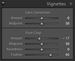
6 ) When applying a dark edge vignette, use a Post Crop vignette with a feather amount close to 80. The default feathering value of 50 is too low.
7 ) Pro users should consider making custom DNG profiles for their camera(s) with the XRite ColorChecker Passport. If not, the “Adobe Standard” is more likely than the other profiles (Camera Landscape, etc) to render pleasing results with a wider variety of images.
8 ) Develop images in Color mode before switching the treatment to Grayscale. Not only will the final grayscale product look better but the image will be ready for color printing should you decide to do so in the future. After applying a Greyscale treatment, re-adjust contrast (if necessary) and use Grayscale Mix (in the HSL panel) to simulate in front of the lens filtration (yellow filter, red filter, etc). This greyscale procedure will yield better results than a haphazard one.
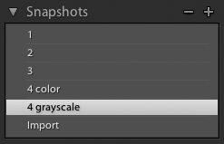
9 ) Use Snapshots to save different versions of your images (ex: grayscale and color, cropping for different aspect ratios, etc). Saving snapshots with numbers is quick and can show a progression of development (when appropriate). Example: 1, 2, 3, 4color, 4grayscale, Import.
10 ) Uncheck the “Apply auto grayscale mix when converting to grayscale” checkbox in Lightroom’s preferences under the Presets tab. Auto=Yuk.
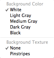
11 ) Set the background to white. You can do this by right-clicking (or control-clicking) on the background color around the image area when set to “Fit” to screen. While a white background may not be as pretty as the default dark gray, it will give you a better idea as to how an image’s highlight and mid-tone densities will appear when printed. A juxtaposition with paper white is critical. Toggle between white and dark grey if you like, but always view and adjust with a white background before printing or exporting.
12 ) Print! Image development can only be mastered by producing gorgeous prints. A lot can and will be learned along the way.
Fortune Cookie of the day: Moderation is good for all things in life, especially with clarity, saturation, vignetting and HSL adjustments.