
Best Practices for Lightroom performance
It's 2020. If you are a Lightroom user, now is a great time to take some steps to reevaluate and optimize your Lightroom catalog. Here are my 2020 LR performance tips:
01 When buying a new machine, get at least 32GB RAM. 32GB is the new minimum.
02 When buying a new machine, buy a big, fast Solid State Drive (SSD). Having 30-40% of that drive open ensures both its performance and longevity. Don't run an SSD close to capacity.

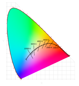
It's time to stop using the Kelvin scale for display calibration
The Kelvin scale has always been relatively simple to understand in the context of display calibration. Choose a higher value and your display white point will be bluer; choose a lower value and it will be yellower, etc. But this is where the simplicity stops and the confusion begins. What do we do if the white point appears to be magenta or greenish? And why doesn’t the display calibration Kelvin value correlate with the value of our lighting? In other words, why does calibrating to ~5700 Kelvin match 4100 Kelvin lights? Why can’t we calibrate to 4100K to match 4100K lights? So…
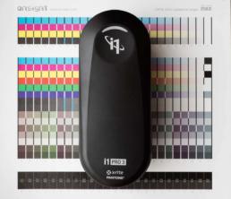
XRite i1Pro3 (standard aperture) review
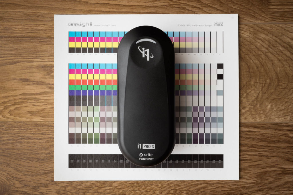 The new i1Pro3 “Swiss Army Knife” of spectrophotometers
XRIte announced the i1Pro3 spectrophotometer and released i1Profiler 3.2 which supports it. This is the standard aperture i1Pro, not to be confused with the large aperture i1Pro3plus. The i1Pro2 was the Swiss Army Knife of spectrophotometers and the best selling of all time. The i1Pro3 is a worthy successor with a variety of…
The new i1Pro3 “Swiss Army Knife” of spectrophotometers
XRIte announced the i1Pro3 spectrophotometer and released i1Profiler 3.2 which supports it. This is the standard aperture i1Pro, not to be confused with the large aperture i1Pro3plus. The i1Pro2 was the Swiss Army Knife of spectrophotometers and the best selling of all time. The i1Pro3 is a worthy successor with a variety of…

XRite i1Pro3plus (large aperture) review
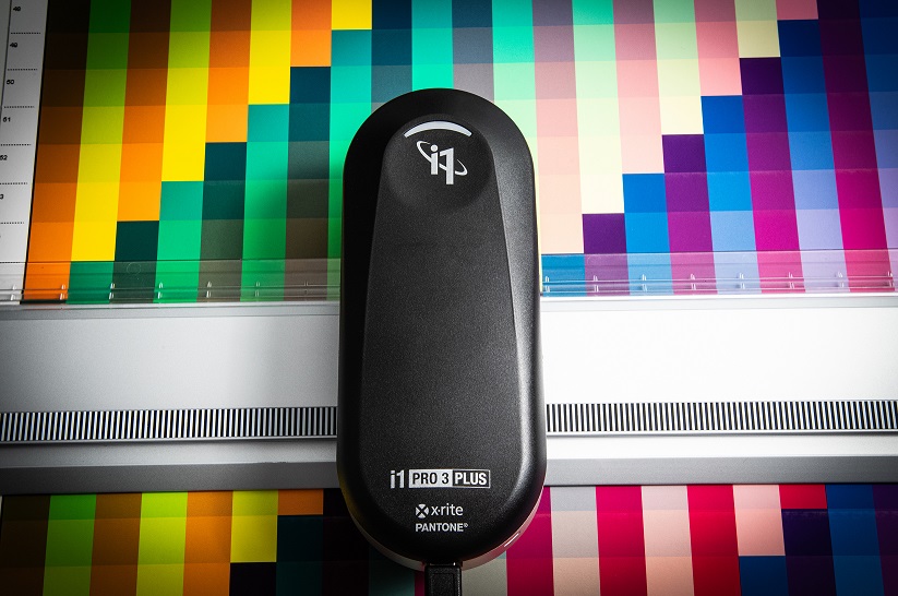 XRite brings back polarized, transmissive and large aperture measurements with the i1Pro3plus spectrophotometer.
Quick overview
The i1Pro3plus spectrophotometer contains a new LED illuminant that allows for simultaneous M0, M1, M2 measurement in a single pass. The large 8mm aperture (vs the i1Pro2’s 3.5mm) translates into rich, extreme shadow measurements and averaging of uneven surfaces and large dot patterns.…
XRite brings back polarized, transmissive and large aperture measurements with the i1Pro3plus spectrophotometer.
Quick overview
The i1Pro3plus spectrophotometer contains a new LED illuminant that allows for simultaneous M0, M1, M2 measurement in a single pass. The large 8mm aperture (vs the i1Pro2’s 3.5mm) translates into rich, extreme shadow measurements and averaging of uneven surfaces and large dot patterns.…

Celebrating 25 Years
25+ years ago I was splitting my time between a job where I was a scanner operator and an apprenticeship with a master printmaker. In the printmaking studio we were making large digital negatives on an imagesetter and using them to make hand-coated platinum/palladium prints in a wet darkroom. Back then everyone was using Photoshop 2 and had CRT monitors. While the color scans coming off the Leaf45 seemed pretty decent after a little color correction in curves, I was frustrated with how different the handmade B&W platinum palladium prints looked in comparison to the same images onscreen.…
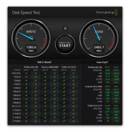
Quick 2019 RAID Evaluation
I had a chance to setup a few new RAID systems last week at different client sites. I always like to do a Blackmagic Disk Speed Test and thought it would be fun to share. Manufacturer's speed claims are one thing but real world performance is another, and much more meaningful.
Here's a Drobo 5D3 connected via Thunderbolt 3 on a new, maxed out iMac. This 5 bay enclosure costs $678 without drives and comes with two Thunderbolt 3 / USB-C ports and one USB 3.0 port.
ChromaMax Part 4: Printer Profiling
The final RIP calibration step is profiling. If the base calibration steps performed beforehand aren’t done properly, you won’t get a get profile. But even if the previous steps are performed perfectly, there is a surprising amount of profiling variables that are important to discuss to ensure we get the best ICC profile possible. ChromaMax targets use bottom weighted patches that allow us to characterize deep shadow color better than traditional targets that distribute patches evenly throughout the tonal range. In the same fashion, its important that we create profiling targets…
ChromaMax Part 3: Printer Total Ink Limiting
The third RIP calibration step is to set the total, combined ink limit of all the channels together. Any given media might be able to hold 100% of any individual ink, but holding 100% of all 4 or more inks simultaneously without bleeding is another matter. With high quality media, there’s also a certain point at which it achieves maximum Dmax. If we use with a higher ink limit than this we’re just wasting ink without benefit. The Chromamax total ink limit step helps us find this precise sweet spot where we’re achieving maximum print quality with the lowest ink consumption.…
ChromaMax Part 2: Printer Linearization
The second RIP calibration step is to linearize the ink channels with their newly restricted ink limits. This generates a set of curves that should produce a tonal response that is rich in shadow color and neutralizes the combined gray axis. The problem here is that many RIPs are still using curve generation algorithms that were created a long time ago and haven’t been updated. These RIPs rely on the final profiling process to “fix” an imperfect linearization, and the results are “good enough” for many. The G7 process introduced an excellent way of automating…
Display Recommendation Thoughts
I get a lot of questions about what displays I recommend, and answering them can be tricky. Some people are seeking justification for spending a lot of money on something they may not need. There are a lot of old notions that we need to forget as well as newer features we need to consider. I have a few display recommendations on the recommendations page, and people often ask me why brands like NEC or Eizo monitors are not on there. My feeling is that the internal calibration hardware that some displays have (NEC, Eizo, Sony, Barco, etc.) played an important role in addressing real issues we…