Scott Martin's Digital Imaging Newsletter
Thoughts, news and techniques for digital imaging professionals


Harriet Jane Martin

My second daughter, Harriet Jane Martin, was born June 5th at our circa 1910 home in San Antonio. This is her on her actual birthday - just a few hours old. Her big sister, Lyda Rose (now 2.5 years) took one look, said "I'm a big sister now" and is enjoying her new role. "My girls" (wife, daughters, cat and dog) are all doing great. What a wonderful time! Thanks for everyone's support and forgiveness if I have been a little slow to respond.

This is the first newsletter since June. Besides being a new dad and traveling to 3 cities a week (on average) my ISP lost the hard drives on the server that handled the newsletter delivery and subscriptions. Never mistake having a mirroed RAID for an adequate backup - they are not the same things. I am now using a localized solution called Direct Mail to deliver this newsletter. Thanks for your patience!


Tidbits
New approach to tone rendering could change the future of digital imaging
Some MIT students have proposed some new approaches to photographic tone rendering that could significantly change the way images are processed in the future. This is serious geek reading but the concepts and results are very impressive. 

Epson K3 black ink conversion costs
If you view the printer's 'usage count' on the latest Epson Pro K3 ink printers (4800, 7800, 9800) before and after a black ink conversion, the difference is typically 93.5ml (your exact results may vary slightly), which represents the total ink that you lose during this process.  If you purchase 110ml cartridges at $49.95 that works out to $42.46 worth of ink. If you purchase 220ml cartridges at $82.50 that works out to $35.06.  Good info to know.

Inkjet printing procedural tip
A good thing to get into the habit of doing is to print a nozzle check on plain paper before every printing session. That way you'll never waste premium paper due to clogged nozzles. 

Photoshop 9.0.1 and Mac OS 10.4.6 color printing problem
In the last newsletter I warned readers about a significant color management problem with Mac OS 10.4.6 and Photoshop 9.0.1  Apple's ColorSync technology was not recognizing PS901 and was performing an unwanted color transformation when printing from Photoshop that caused color halos in the highlights. Apple's free OS 10.4.7 update corrects the problem. If you are running Photoshop 9.0.1 make sure you are using any OS other than 10.4.6 to avoid this printing problem. 

Adobe Camera RAW 3.5 and DNG Converter updates
Adobe just released version 3.5 of thier Camera RAW Plug-in and DNG Converter which adds support for Nikon D2Xs, Kodak EasyShare P712, Panasonic DMC-FZ50 and DMC-L1, and the Sony A1 cameras. Support for the NIkon D80 and Canon RebelXti (400D) will be available in the next release later this year. This is the first Universal Binary release of the DNG Converter which provides a substantial speed increase for Intel based Macs.

Fiber Base Paper update
I was initially quite impressed with Innova FibaPrint F-Type but after printing a large show with lots of heavy ink coverage I became frustrated with its surface imperfections and scratch susceptibility. I have since switched to Hahnemuhle Pearl and have far less reject prints and enjoy the slightly warmer base color of Pearl. This is the fiber base paper I have found most people prefer.

Color Management App with Gamut rendering for Windows XP
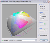
Mac OS users have long enjoyed the gamut rendering feature in the ColorSync Utility that comes with OS X. Gamut rendering lets you see a 3D representation of a ICC Profile's color gamut. People particularly like to use this feature to compare the color gamuts of different printing processes and papers. Microsoft now offers a free gamut rendering Control Panel Applet that anyone with Windows XP can download and start using. 

At last, everyone now has access to a free gamut rendering application. These applications are fairly basic, so if you are looking for something that is more visually rich with more capabilities I would recommend X-Rite's Monaco Gamutworks, or ColorThink Pro (both commercial products). Many of you have seen me demonstrate gamut renderings with these applications.


Thoughts and commentary on Glossy versus Matte LCD monitors
Sony, Toshiba and a few others have offered laptops with shiny, glossy monitors for several years but now that Apple's Mac Books are available in either a matte or glossy monitor a lot of people have been asking me which they should get for their professional use. There is certainly a "wow" factor to the glossy monitors. The DMax (blacks) are very rich as are the contrast and apparent color saturation on these monitors. This differences are, in fact, very similar to comparing a matte surface print to a super glossy Cibachrome print.

The disadvantages to these glossy monitors are that the blacks, contrast and saturation usually appear greater than they will on the final prints. One must also calibrate a glossy LCD with the lights off or with a cloth over the monitor because the extra acetate over the LCD can distribute the ambient light to the sensor. The worst problem with these glossy monitors is that reflections and glare inhibit critical viewing of image tonality.

In my opinion, consumers will enjoy the "wow" factor of these glossy monitors but photographers, designers, and prepress professionals should stick to matte LCD monitors. 


Tip of the month: Color to black and white image conversion in Photoshop
There are many, many ways to take a color image and make it black and white. Simply converting an image to Grayscale mode produces a fairly muddy, low contrast image. If you view an image's red, green and blue channels independently you'll notice that the red channel contains a very high contrast version of your image with light skin tones. The green channel contains a fairly flat rendition of the scene and the blue channel contains a grainy/noisy rendition with a disturbing quality to people's eyes. Photoshop's Channel Mixer let's us choose what percentage of each of these three channels we use for conversion to black and white. Here's how:

1) Start with a color image in any RGB colorspace.
2) Start a new adjustment layer (on top of all other layers) using the Channel Mixer.
3) Check the Monochrome checkbox in the lower left hand corner of the dialog.
4) Dial in as much of each channel that you wish to use. I suggest using R=60 G=30 B=10 as a starting point for these adjustments. Make sure the three channels add up to 100. Do not use negative values or values over 100.
5) Choose "OK"
6) Toggle this adjustment layer's visibility (by clicking on its eye icon) to switch between color and black and white versions of this image.

This technique is nothing new; I've been showing it to people for over a decade. Since we are all shooting digital in color (whether we want to or not) I thought it would be a good time to revisit this intelligent utilization of color information. With this technique we can simulate the in-front-of-the-lens filtrations that we used to do when shooting black and white films. Want to simulate shooting black and white film with a red filter? Try R=100 G=0 B=0. A yellow filter? Try R=50 G=50 B=0. See? All that color information your camera is recording really is valuable for your black and white image work. 

I would like to note that if you have an RGB scan of a black and white original, there is no advantage to this technique since there is no color information to work with.

This image demonstrates an original in its color, grayscale and channel mixer 60/30/10 converted versions.

Feedback
As always, I love to hear from you. Please drop me a line and let me know how everything is going for you. Comments and suggestions for this newsletter are appreciated too.

Scott Martin
scott@on-sight.com
www.on-sight.com


© Scott Martin - Digital Photography Training and Consulting - 210.224.1113 - www.on-sight.com

The contents of this page may not be reproduced in any form without written permission.